Changing the face of Dutch television
KRO-NCRV
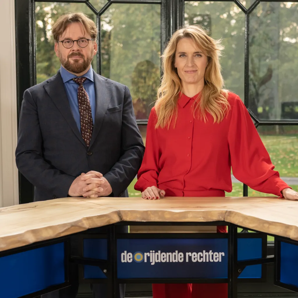
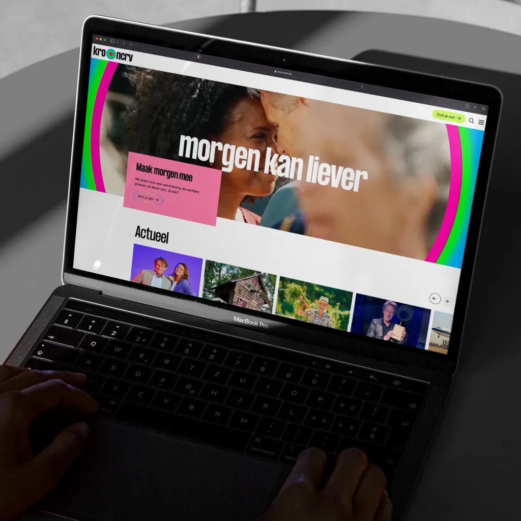
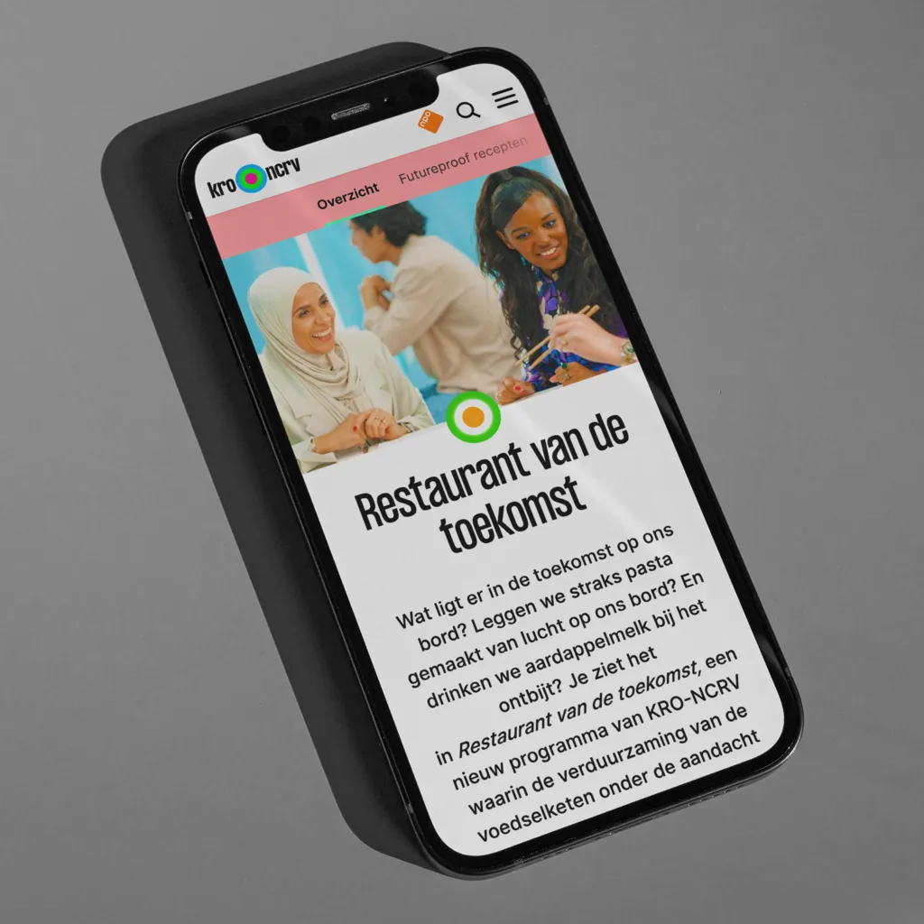
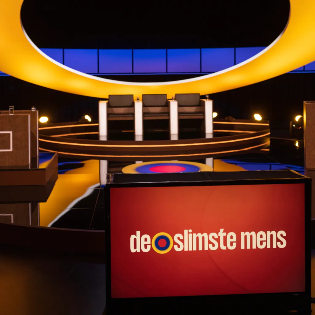
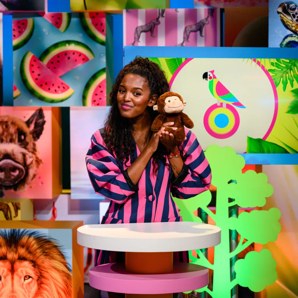
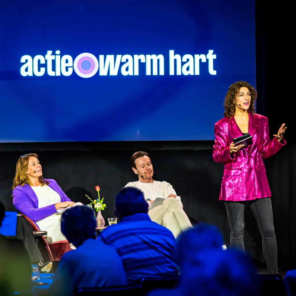
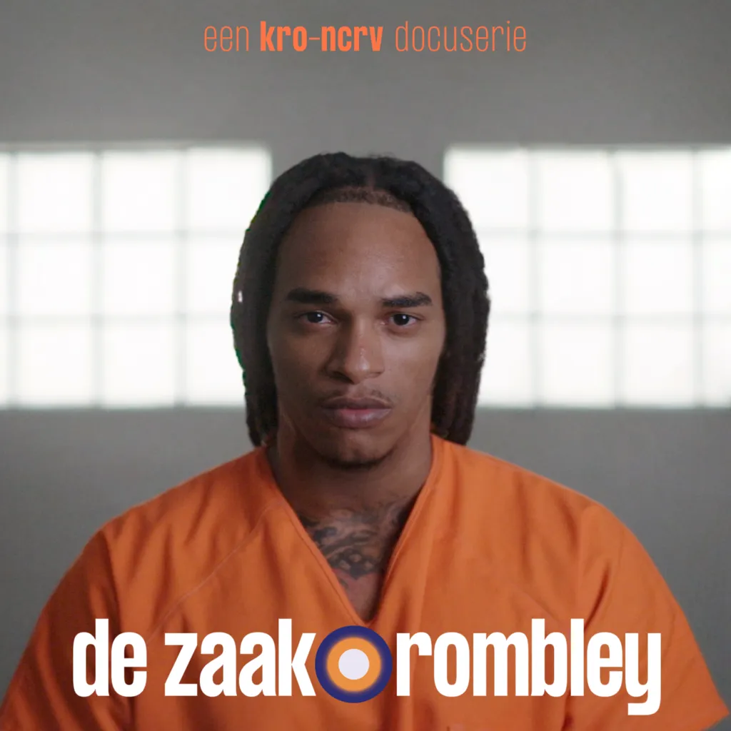
In the dynamic world of broadcasting, KRO-NCRV decided it was time for a change – a visual transformation that speaks to its new positioning and diverse programming. We created a fresh, colorful identity system that ties together 270 individual programs with a unifying, yet distinct, visual language.
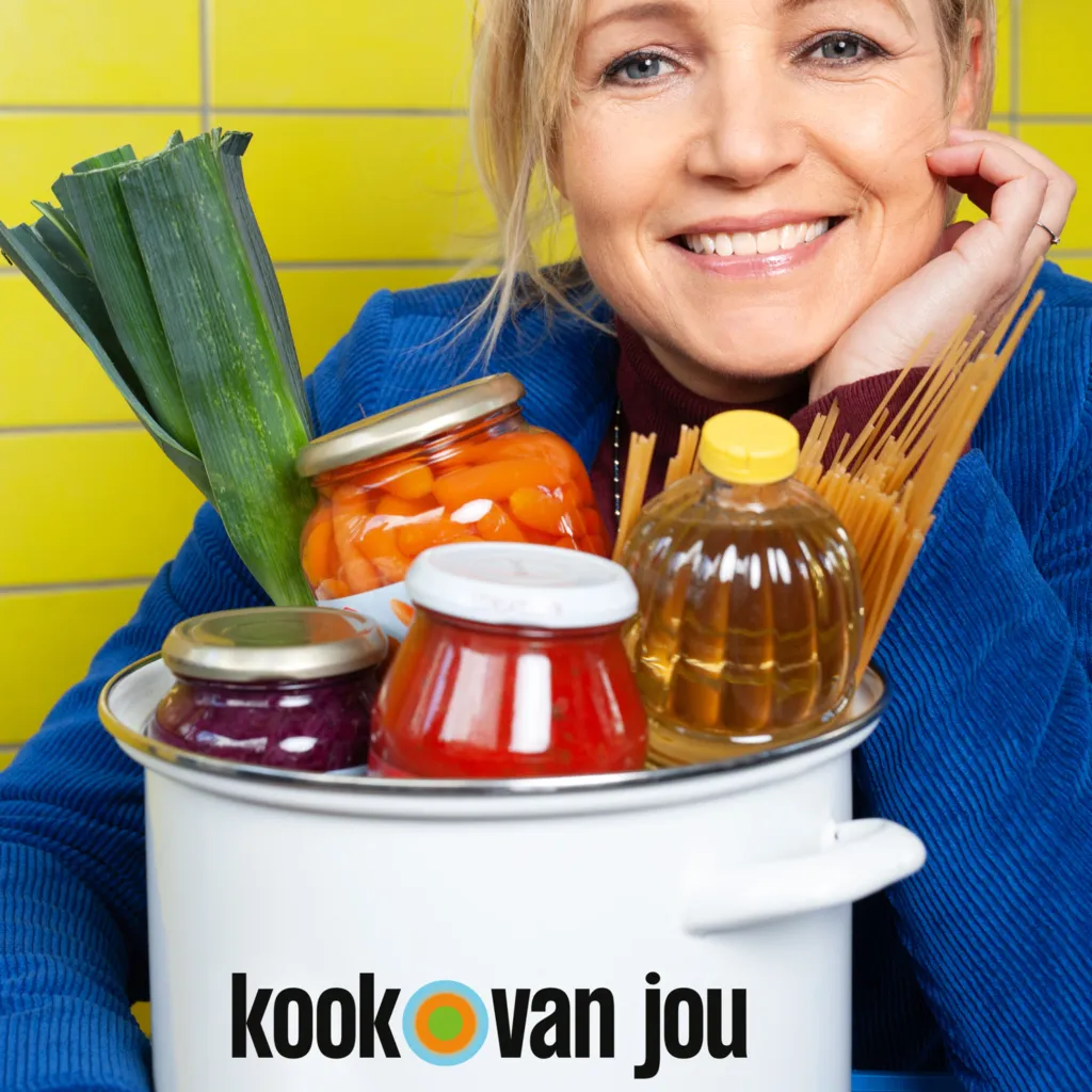
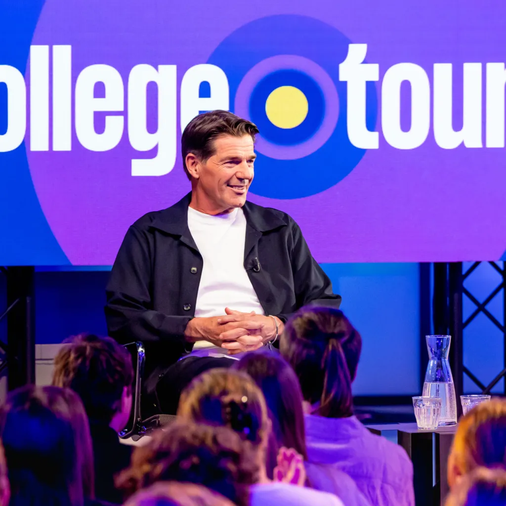
‘Our new logo aligns with the inspiration we aim to provide and the optimism that together we can make the world of tomorrow better. Therefore, we opted for a distinctive typeface and a striking colour circle. This circle serves as the unifying element across all our programmes.'
Further Info
Collaboration
Strategy – with Roel Stavorinus
Sound design — Big Orange
Website — with Verve
Campaign — with Roorda